Leonardo

Analysis color space

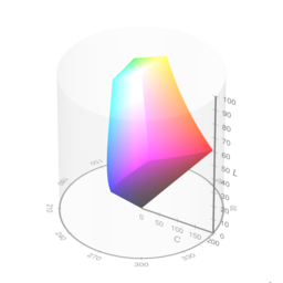
Charts and models will display in the selected color space. A uniform color space is recommended.

Theme settings

100%
100%
100%

Color tools for design systems

What is Leonardo?

Leonardo is a one-of-a-kind tool for creating, managing, and sharing accessible color systems for user interface design and data visualization.

In-depth color analysis

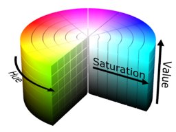
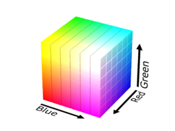
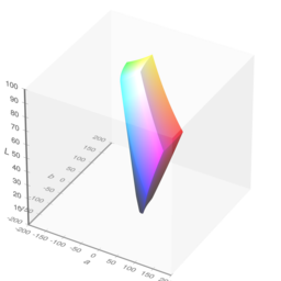
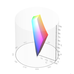
Charts and 3d models allow you to evaluate your color theme like never before.

Precise color control

Choose from a variety of color spaces to create perceptually balanced color scales.

Contrast-ratio-based color generation

Color swatches are generated by target contrast ratios so you no longer need to manually check contrast.

Controls are paired with lightness inputs so you can also define your swatches by target lightness.

Dark mode in seconds

Leonardo’s adaptive themes enable you to change the brightness, contrast, and saturation in less time than ever before.

Streamlined design resources

Download your theme or color scales as SVG files. Copy and paste directly into your design tool of choice.

Output for your engineers

Theme parameters for @adobe/leonardo-contrast-colors, CSS custom properties, and Design Tokens following the w3c working spec.

Data visualization scales

Advanced control over perceptually uniform sequential and diverging color scales.

End-user personalization

Leonardo’s npm module can be used to give your end-users an inclusive, adaptive theme. Your users can change the overall contrast, brightness, and saturation of their experience.

Colorblind safe colors made easy

Automatically cycle through your colors to create a colorblind safe palette.

Advanced controls allow for displaying colors with greater color difference, or only colors that meet a 3:1 contrast minimum.

Compare colors for contrast and more

Check color contrast between two colors with alpha transparency support.

Stop the guesswork on color blind safety. Leonardo evaluates the measurable color difference between two colors for each color vision deficiency type.

Open source

Leonardo is an Adobe open source project. You can help improve Leonardo to better suit your needs.

Want to learn more?

Visit the Getting started section or visit Github for more detail on how to use Leonardo. Additional information is available in the Articles section from publications about Leonardo and its core concepts.

Leonardo JS API


The API docs will help you to use @adobe/leonardo-contrast-colors in your development environment.

Quick start

Install the package:

npm i @adobe/leonardo-contrast-colors
    

Import the package:

CJS (Node 12.x)

const { Theme, Color, BackgroundColor } = require('@adobe/leonardo-contrast-colors');
    

ESM (Node 13.x)

import { Theme, Color, BackgroundColor } from '@adobe/leonardo-contrast-colors';
    

Create and pass colors and a background color to a new Theme (see additional options below):

let gray = new BackgroundColor({
          name: 'gray',
          colorKeys: ['#cacaca'],
          ratios: [2, 3, 4.5, 8]
        });

    let blue = new Color({
          name: 'blue',
          colorKeys: ['#5CDBFF', '#0000FF'],
          ratios: [3, 4.5]
        });

    let red = new Color({
          name: 'red',
          colorKeys: ['#FF9A81', '#FF0000'],
          ratios: [3, 4.5]
        });

    let theme = new Theme({colors: [gray, blue, red], backgroundColor: gray, lightness: 97});

    // returns theme colors as JSON
    let colors = theme.contrastColors;
    

API Reference

Theme

Class function used to generate adaptive contrast-based colors. Parameters are destructured and need to be explicitly called.

Parameter Type Description
colors Array List of Color classes to generate theme colors for. A single BackgroundColor class is required.
lightness Number Value from 0-100 for desired lightness of generated theme background color (whole number)
contrast Number Multiplier to increase or decrease contrast for all theme colors (default is 1)
saturation Number Value from 0-100 for decreasing saturation of all theme colors (default is 100)
output Enum Desired color output format

Setters

Setter Description of output
Theme.lightness Sets the theme's lightness value
Theme.contrast Sets the theme's contrast value
Theme.saturation Sets the theme's saturation value
Theme.backgroundColor Sets the theme's background color (creates a new BackgroundColor if passing a string)
Theme.colors Sets colors for theme (must pass Color)
Theme.output Sets output format for theme
Theme.addColor Add a Color to the theme
Theme.removeColor Remove a Color from the theme
Theme.updateColor Update a Color via its setters from the theme

Theme.addColor = color

Add a Color to an existing theme

let red = new Color({
    name: 'red',
    colorKeys: ['#FF9A81', '#FF0000'],
    ratios: [3, 4.5]
});

theme.addColor = red;
    

Theme.removeColor = color

Remove a Color from an existing theme. Accepts an object with the Color's name and value, or by passing the Color class itself.

// Remove via color name
theme.removeColor = {name: 'Red'};

// Remove via Color class
const red = new Color({
   name: 'red',
   colorKeys: ['#FF9A81', '#FF0000'],
   ratios: [3, 4.5]
});

theme.removeColor = red;
    

Theme.updateColor = {name, property}

Update a Color via its setters from the theme. Accepts an object with the name of the color you wish to modify, followed by the property and the new value you wish to modify.

// Change the colors ratios
theme.updateColor = {color: 'red', ratios: [3, 4.5, 7]};

// Change the colors colorKeys
theme.updateColor = {color: 'red', colorKeys: ['#ff0000']};

// Change the color's name
theme.updateColor = {color: 'red', name: 'Crimson'};
    

Alternatively, it's possible to change all 3 properties in the same call.

// It's also possible to change the color name and colorKeys in the same function
theme.updateColor = {color: 'red', ratios: [3, 4.5, 7], colorKeys: ['#ff0000'], name: 'Crimson'};
    

Supported output formats:

Available output formats conform to the W3C CSS Color Module Level 4 spec for the supported options, as listed below:

Output option Sample value
'HEX' (default) #RRGGBB
'RGB' rgb(255, 255, 255)
'HSL' hsl(360deg, 0%, 100%)
'HSV' hsv(360deg, 0%, 100%)
'HSLuv' hsluv(360, 0, 100)
'LAB' lab(100%, 0, 0)
'LCH' lch(100%, 0, 360deg)
'CAM02' jab(100%, 0, 0)
'CAM02p' jch(100%, 0, 360deg)

Color

Class function used to define colors for a theme. Parameters are destructured and need to be explicitly called.

Parameter Type Description
name String User-defined name for a color, (eg "Blue"). Used to name output color values
colorKeys Array of strings List of specific colors to interpolate between in order to generate a full lightness scale of the color.
colorspace Enum The colorspace in which the key colors will be interpolated within.
ratios Array or Object List of target contrast ratios, or object with named keys for each value.
smooth Boolean Applies bezier smoothing to interpolation (false by default)
output Enum Desired color output format

Setters

Setter Description of output
Color.colorKeys Sets the color keys
Color.colorspace Sets the interpolation colorspace
Color.ratios Sets the ratios
Color.name Sets the name
Color.smooth Sets the smoothing option
Color.output Sets the output format

Supported interpolation colorspaces:

Below are the available options for interpolation in Leonardo:

Ratios as an array

When passing a flat array of target ratios, the output colors in your Theme will be generated by concatenating the color name (eg "Blue") with numeric increments. Colors with a positive contrast ratio with the base (ie, 2:1) will be named in increments of 100. For example, gray100, gray200.

Colors with a negative contrast ratio with the base (ie -2:1) will be named in increments less than 100 and based on the number of negative values declared. For example, if there are 3 negative values [-1.4, -1.3, -1.2, 1, 2, 3], the name for those values will be incremented by 100/4 (length plus one to avoid a 0 value), such as gray25, gray50, and gray75.

For example:

new Color({
      name: 'blue',
      colorKeys: ['#5CDBFF', '#0000FF'],
      colorSpace: 'LCH',
      ratios: [3, 4.5]
    });

    // Returns:
    [
      {
        name: 'blue',
        values: [
          {name: "blue100", contrast: 3, value: "#8d63ff"},
          {name: "blue200", contrast: 4.5, value: "#623aff"}
        ]
      }
    ]
    

Ratios as an object

When defining ratios as an object with key-value pairs, you define what name will be output in your Leonardo theme.

new Color({
      name: 'blue',
      colorKeys: ['#5CDBFF', '#0000FF'],
      colorSpace: 'LCH',
      ratios: {
        'blue--largeText': 3,
        'blue--normalText': 4.5
      }
    });

    // Returns:
    [
      {
        name: 'blue',
        values: [
          {name: "blue--largeText", contrast: 3, value: "#8d63ff"},
          {name: "blue--normalText", contrast: 4.5, value: "#623aff"}
        ]
      }
    ]
    

Output examples

There are two types of output you can get from the Theme class: | Getter | Description of output | |--------|-----------------------| | Theme.contrastColors | Returns array of color objects with key-value pairs | | Theme.contrastColorPairs | Returns object with key-value pairs | | Theme.contrastColorValues | Returns flat array of color values |

Theme.contrastColors

Each color is an object named by user-defined value (eg name: 'gray'). "Values" array consists of all generated color values for the color, with properties name, contrast, and value:

[
      { background: "#e0e0e0" },
      {
        name: 'gray',
        values: [
          {name: "gray100", contrast: 1, value: "#e0e0e0"},
          {name: "gray200", contrast: 2, value: "#a0a0a0"},
          {name: "gray300", contrast: 3, value: "#808080"},
          {name: "gray400", contrast: 4.5, value: "#646464"}
        ]
      },
      {
        name: 'blue',
        values: [
          {name: "blue100", contrast: 2, value: "#b18cff"},
          {name: "blue200", contrast: 3, value: "#8d63ff"},
          {name: "blue300", contrast: 4.5, value: "#623aff"},
          {name: "blue400", contrast: 8, value: "#1c0ad1"}
        ]
      }
    ]
    

Theme.contrastColorPairs

Simplified format as an object of key-value pairs. Property is equal to the generated or user-defined name for each generated value.

{
      "gray100": "#e0e0e0";
      "gray200": "#a0a0a0";
      "gray300": "#808080";
      "gray400": "#646464";
      "blue100": "#b18cff";
      "blue200": "#8d63ff";
      "blue300": "#623aff";
      "blue400": "#1c0ad1";
    }
    

Theme.contrastColorValues

Returns all color values in a flat array.

[
      "#e0e0e0",
      "#a0a0a0",
      "#808080",
      "#646464",
      "#b18cff",
      "#8d63ff",
      "#623aff",
      "#1c0ad1"
    ]
    

Leonardo with CSS variables

Here are a few examples of how you can utilize Leonardo to dynamically create or modify CSS variables for your application.

Vanilla JS

let varPrefix = '--';

    // Iterate each color object
    for (let i = 0; i < myTheme.length; i++) {
      // Iterate each value object within each color object
      for(let j = 0; j < myTheme[i].values.length; j++) {
        // output "name" of color and prefix
        let key = myTheme[i].values[j].name;
        let prop = varPrefix.concat(key);
        // output value of color
        let value = myTheme[i].values[j].value;
        // create CSS property with name and value
        document.documentElement.style
          .setProperty(prop, value);
      }
    }
    

React

Create a new Theme component Theme.js with your parameters:

import * as Leo from '@adobe/leonardo-contrast-colors';

    const Theme = () => {
      let gray = new Leo.BackgroundColor({
        name: 'gray',
        colorKeys: ['#cacaca'],
        ratios: [2, 3, 4.5, 8]
      });

      let blue = new Leo.Color({
        name: 'blue',
        colorKeys: ['#5CDBFF', '#0000FF'],
        ratios: [3, 4.5]
      });

      let red = new Leo.Color({
        name: 'red',
        colorKeys: ['#FF9A81', '#FF0000'],
        ratios: [3, 4.5]
      });

      const adaptiveTheme = new Leo.Theme({
        colors: [
          gray,
          blue,
          red
        ],
        backgroundColor: gray,
        lightness: 97,
        contrast: 1,
      });

      return adaptiveTheme;
    }

    export default Theme;
    

Then import your Theme component at the top level of your application, and pass the Theme as a property of your app:

// index.js
    import Theme from './components/Theme';

    ReactDOM.render(
      <React.StrictMode>
        <App adaptiveTheme={Theme()}/>
      </React.StrictMode>,
      document.getElementById('root')
    );
    

In your App.js file, import useTheme from css-vars-hook and provide the following within your App function in order to format Leonardo's output in the structure required for css-vars-hook.

// App.js
    import {useTheme} from 'css-vars-hook';

    function App(props) {
      const [lightness, setLightness] = useState(100);
      const [contrast, setContrast] = useState(1);

      const _createThemeObject = () => {
        let themeObj = {}
        props.adaptiveTheme.contrastColors.forEach(color => {
          if(color.name) {
            let values = color.values;
            values.forEach(instance => {
              let name = instance.name;
              let val = instance.value;
              themeObj[name] = val;
            });
          } else {
            // must be the background
            let name = 'background'
            let val = color.background;
            themeObj[name] = val;
          }
        })
        return themeObj;
      };

      const theme = useState( _createThemeObject() );

      const {setRef, setVariable} = useTheme(theme);

      return (
        <div
          className="App"
          ref={setRef}
          >
        </div>
      )
    }
    

To make your application adaptive, include a function for updating your theme before your return function:

  function _updateColorVariables() {
        let themeInstance = _createThemeObject();

        for (const [key, value] of Object.entries( themeInstance )) {
          setVariable(key, value);
        }
      };
      // call function to set initial values
      _updateColorVariables();
    

Finally, reference this function and set the theme parameters when your users interact with slider components (do the same for Contrast):

<label htmlFor="lightness">
      Lightness
    </label>
    <input
      value={lightness}
      id="lightness"
      type="range"
      min={ sliderMin }
      max={ sliderMax }
      step="1"
      onChange={e => {
        setLightness(e.target.value)
        props.adaptiveTheme.lightness = e.target.value
        _updateColorVariables()
      }}
    />
    <label htmlFor="contrast">
      Contrast
    </label>
    <input
      value={contrast}
      id="contrast"
      type="range"
      min="0.25"
      max="3"
      step="0.025"
      onChange={e => {
        setContrast(e.target.value)
        props.adaptiveTheme.contrast = e.target.value
        _updateColorVariables()
      }}
    />
    

Dark mode support in React

Include the following in your App.js file to listen for dark mode. This will pass a different lightness value (of your choice) to Leonardo. It's recommended to restrict the lightness range based on mode in order to avoid inaccessible ranges and to provide a better overall experience

const mq = window.matchMedia('(prefers-color-scheme: dark)');
    // Update lightness and slider min/max to be conditional:
    const [lightness, setLightness] = useState((mq.matches) ? 8 : 100);
    const [sliderMin, setSliderMin] = useState((mq.matches) ? 0 : 80);
    const [sliderMax, setSliderMax] = useState((mq.matches) ? 30 : 100);

    // Listener to update when user device mode changes:
    mq.addEventListener('change', function (evt) {
      props.adaptiveTheme.lightness = ((mq.matches) ? 11 : 100)
      setLightness((mq.matches) ? 11 : 100)
      setSliderMin((mq.matches) ? 0 : 80);
      setSliderMax((mq.matches) ? 30 : 100);
    });
    

Why are not all contrast ratios available?

You may notice the tool takes an input (target ratio) but most often outputs a contrast ratio slightly higher. This has to do with the available colors in the RGB color space, and the math associated with calculating these ratios.

For example let's look at blue and white. Blue: rgb(0, 0, 255) White: rgb(255, 255, 255) Contrast ratio: 8.59:1

If we change any one value in the RGB channel for either color, the ratio changes: Blue: rgb(0, 1, 255) White: rgb(255, 255, 255) Contrast ratio: 8.57:1

If 8.58 is input as the target ratio with the starting color of blue, the output will not be exact. This is exaggerated by the various colorspace interpolations.

Since the WCAG requirement is defined as a minimum contrast requirement, it should be fine to generate colors that are a little more accessible than the minimum.


Chroma.js

This project is currently built using Chroma.js with custom extensions to supportCIE CAM02. Additional functionality is added in Leonardo to enhance chroma scales so that they properly order colors by lightness and correct the lightness of the scale based on HSLuv.

Contributing

Contributions are welcomed! Read the Contributing Guide for more information.

Development

You can run tests and watch for changes with:

npm run dev
    

Licensing

This project is licensed under the Apache V2 License. See LICENSE for more information.

Learn Leonardo


Color

The color system tab is for defining your color palette and the color scales for each color.

Your color palette represents each primary color of your system. You can evaluate the color harmony of your palette. The color wheel is available to view in a variety of color spaces .

Your color scales are a full value scale for each of your palette colors. This allows you to design color as a fluid continuum of tints and shades.

Color scales are defined by three parts: Color keys, interpolation colorspace, and smoothing.

Color keys

Color keys are specific colors that you want the include within the scale. Each color key is automatically sorted and placed on the gradient by it's lightness. This is to ensure the scale follows a consistent change in lightness from dark to light colors.

Interpolation colorspace

This specifies which color space you wish to interpolate between your color keys, black, and white. Color is defined differently within each color space, so the resulting gradient of your color scale will appear differently for each.

Smoothing

Leonardo offers catmull-rom smoothing for all interpolation color spaces. By default, interpolation is linear. In some cases, this will yield good results. For other cases, smoothing provides an adjustment to the interpolation that makes the transition of colors within your color scale appear much more balanced and smooth.

Contribute


Add a color scale to begin

Monochromatic preview (ordered by contrast ascending)
Contrast
Lightness

Color wheel settings
WCAG compliance

Colorblind support
11
Blue 100
Blue 500
Color blind safe colors

Parameters for @adobe/leonardo-contrast-colors

See Getting started for information on how to use these parameters.


CSS properties


Design tokens

See w3c working group spec for details.


Output color format

Output formats compliant with CSS Color Module Level 4 . Not all formats supported.

Add bulk key colors to color scale


Enter hex colors separated by comma or new line.

These will be added as key colors to this color scale.

Import lightness stops


Enter hex colors separated by comma or new line.

These will be converted and added as lightness stops.

Import from URL

Enter the URL of your existing color to add to this theme.

The configurations will be added to a new color scale.

You're in CVD simulation mode. Copying generated colors will not be affected by simulation mode.